Material Design is a design language created by Google. Initially, it was announced on June 25, 2014, at the Google I/O developer conference. Before it was officially dubbed “Material Design”, employees referred to it by the codename “Quantum Paper”. With Material Design paper becomes a metaphor; the aesthetic represents a flat sheet of floating in 3D space.
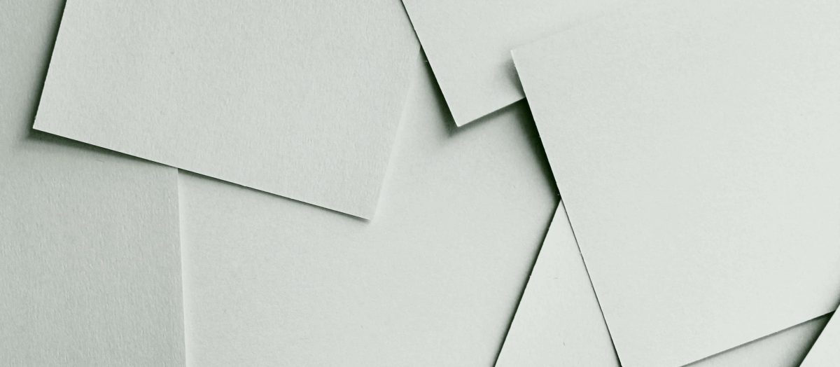
According to Google, Material Design’s visual goal was met by blending classic design principles (Flat Design) with modern innovations found in science and technology. The philosophy behind Material Design was based on the belief that the user interface should be regarded as a tangible object. The aesthetic is birthed from real-world materials: specifically paper and ink. However, instead of a paper pasted flat against a background, this paper appears floating due to the use of shadows and lighting which create depth and edges. To put a sample screen in perspective, imagine a series of cards cut in rectangular shapes hovering slightly above the background.
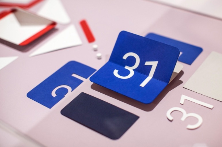
Source: Google Design Library
Flat Design Vs Material Design, What’s the difference?
Flat design is the bare minimum. It can be found implemented in relics from the paleolithic era of print advertising. It does not the use of textures, shadows, and gradients, it’s functionality in its strictest form.
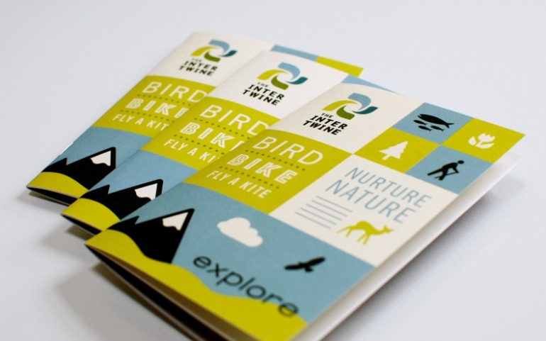
Source: Bureau of Betterment
Google had respect for the past and perhaps was unsatisfied with the bubbly, rounded design that was taking the industry and wanted to introduce something more stern. They took the rigid nature of flat design and let it fly gracefully above the landscape. This became Google’s bold new look.
5 Principles of Material Design
- The material is the metaphor.
Material Design takes inspiration from the physical. Paper and ink cast reflect light and cast shadows on the backdrop below.
- Bold, graphic, intentional.
Material Design uses their specific brand of typography, grids, space, color, and imagery, to create coherence and immersiveness.
- Motion provides meaning.
Animation is an important component of Material Design. Movements and actions should mimic the physical world. How would paper react?
- Flexible foundation.
Material Design is meant to be used as a designer’s canvas. It is integrated with a custom codebase that allows the use of outside components, plug-ins, and design elements.
- Cross-platform.
The UI design is universal, outside platforms welcome it, using shared components across Android, iOS, Flutter, and the web.
What is its Purpose?
Material Design has satisfied two needs for Google: it unified the company’s products and Android app interfaces.
A good product can only get far if it’s pleasing to use. A clunky design will easily deter a user even if the product serves a purpose. With Material Design Google is protecting the sanctity of its brands. When a large portion of your business depends on the projects of outside developers and designers, it’s important for the sake of your relevance to encourage these creators to develop in your image.
By implementing Material Design so stringently, Google is showing us that it really cares about the coherence of design, something that has haunted them in the past. Something that granted their competitor, Apple, an advantage in the past.
What is Material Theming?
This year at I/O 2018, Google introduced the next level of Material Design: Material Theming. It was released to solve an identity crisis. The goal is to introduce a clean framework that can be personal yet conforming enough to fall into a trademark eco-system. Developers divert more focus on the functionality and let Material Theming act as a guardrail in case their creative passion stretches too far.
To prove the validity of their effort, Google has teamed up with various companies to portray what a popular app would look like after being overhauled with the Material Design framework.
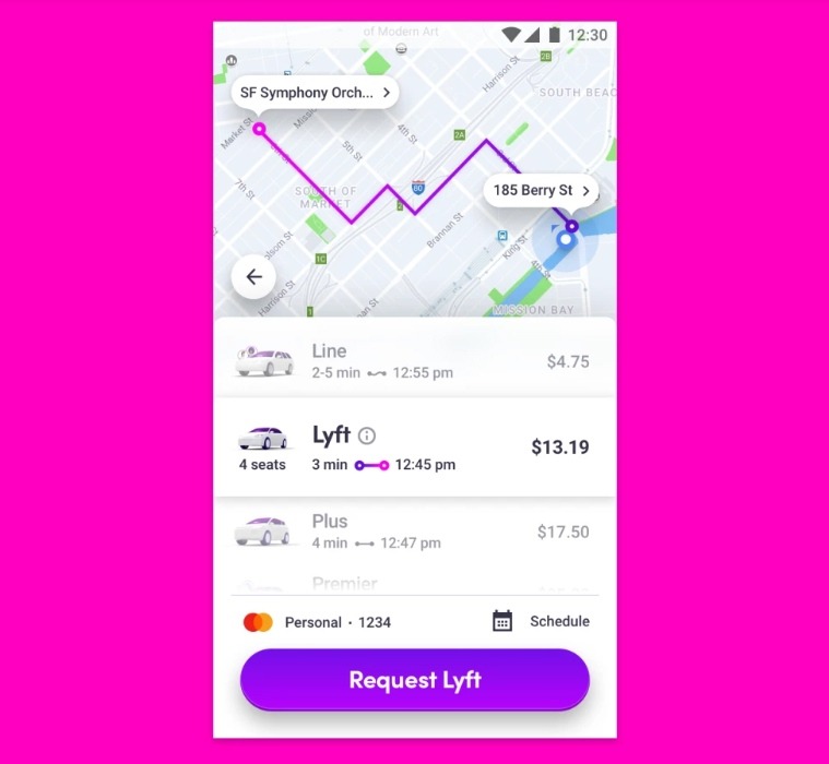
Source: 9to5google
 Popular ride-sharing app Lyft after a Material Design makeover
When Material Design was first introduced one of its biggest flaws was that everything became “Google”. It was difficult for the developer to add their personal touch to anything using this framework; designing was monotonous.
Material Theming is the ability to customize Material Design elements to reflect your product’s brand. Material Theming tools apply your vision throughout the user interface of the product. These tools allow you to easily switch between the design and code behind it by providing specific values for these tailorable attributes.
The Material plugin allowed “Google to look different from developers,” as Matías Duarte, VP of Material Design at Google put it. Looking to create an app tailored to the heavy metal community? Throw in as many gothic colors as you see fit. And it does not just color you get to have a say in. App designers can use the plugin’s tools to create unique button styles and import any typeface to your project.
Don’t worry about pushing the design too far. The plugin uses an algorithm that ensures the coherency of your design, ensuring each component complements each other.
For more information on Material Theming see “Implementing your theme”.
Using Material Theming
Material Theming consists of three main abilities: customizing your theme, applying it across your design sketches, and translate it to code.
Material Theme Editor
The Material Theme Editor is a tool that allows you to customize, color, type, shape, and create your own branded symbol library.
It’s available for the popular prototyping app Sketch. You can download the Material plugin, and begin designing in Google’s image.
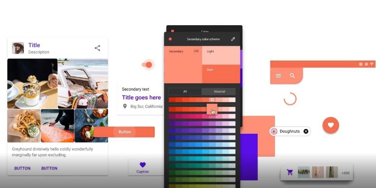
Source: Engadget
Conclusion
If your the type to reject supplementary frameworks and only risk going by your unique vision, good luck, and more power to you. But if you have a revolutionary idea but are unsure of how to translate it into a modern, coherent, interactive image, Google is here to help you every step of the way. Building purposeful applications is already hard enough, why not allow Google to provide you with a toolbox?
