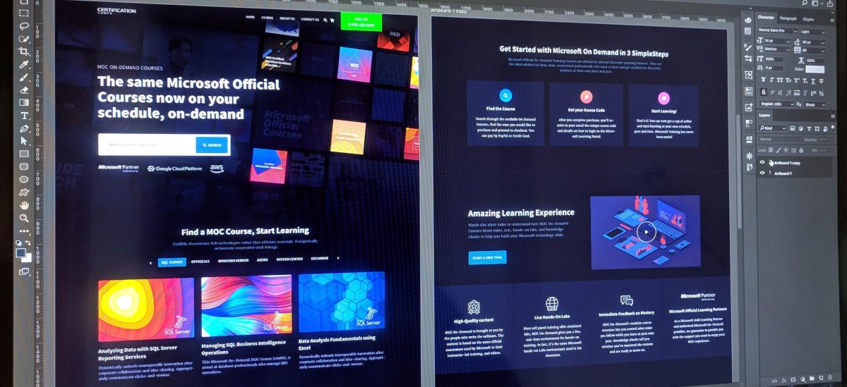
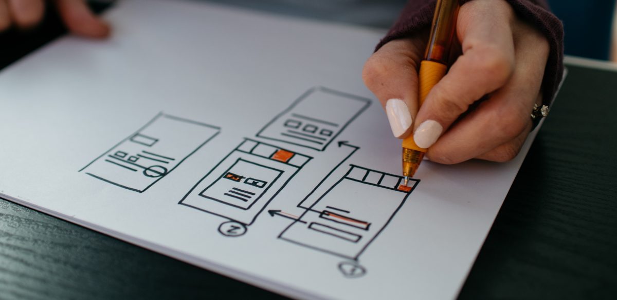
The debate between Sketch and Photoshop is blazing stronger than ever. Photoshop has been the most commonly used tool when making mockups for mobile and web design for years. However, it seems that the days of Photoshop’s reign in the industry are no more. Sketch has been bubbling quietly for some time now but with the latest release of Sketch 3, I wouldn’t be surprised if Adobe is panicking about losing some of its market share.
Photoshop: Tried and True
Even though Adobe Photoshop was primarily meant as a tool for photographers to edit their captured images, its vast array of features allow web/mobile designers to produce impressive works.
Photoshop has seniority on its side. Clients are most likely aware of what a PSD is. These native files constructed in Photoshop are composed of layers that can be picked apart and manipulated. Clients request them for references and front-end developers are knowledgeable in applying them.
Some features of Adobe Photoshop that make it a useful tool for web and mobile app designing include:
- Libraries. Assets that can be used in other Adobe software (Illustrator, for example), files and future projects.
- Smart objects. Layers that contain image data from raster or vector images. Smart Objects preserve an image’s source content with all its original characteristics allowing you to perform nondestructive editing to that layer. Illustrator is Adobe’s predominant vector based program. Designers can easily create a logo element for their app or website then transfer it over to Photoshop where they would then organize everything.
- Extracting Assets. In recent times Photoshop has made it simple for designers to extract objects, elements, and images for web and mobile elements with the help of plugins such as Cut&Slice and DevRocket. This is crucial for mobile app developers as they must be knowledgeable of the dimensions for each individual element.
- Layer Compositions. Layer comps enable a designer to deviate from the initial design by tweaking attributes, positioning, and the visibility of the elements without the need of making multiple copies of the design. This proves hugely beneficial when dealing with mobile applications for example as many app screens are clearly identical but differentiate in individual buttons and links.
Sketch
After seemingly monopolizing the design software industry for more than two decades, an opponent worthy of Adobe’s attention has risen. Hundreds of professional grade designers have already made the switch from Photoshop to Sketch.
The question is, why has Sketch been so disruptive?
100% Vector
With the adaptation of retina displays and mobile devices, designing your app while taking different screen sizes into account, seems like a huge time waster. A burden that should be simplified, and luckily it is. The answer is vector graphics. Vector graphics are graphic images electronically coded to be represented in lines rather than fixed bitmaps, allowing an image, as on a computer display screen, to be rotated or proportionally scaled. In other words no matter how much you shrink or enlarge the image, the quality remains static.
Code-friendly Designs
All properties that you can implement to your designs within Sketch (shadows, borders, gradients) are possible on CSS. This is important as it establishes a seamless connection between designing and developing. Due to Photoshop’s intricate nature, you can go wild on lighting patterns, textures and drop shadows that translate to CSS or mobile quite poorly. The primary reasoning being that Photoshop is a tool originally made for photo editing and complex graphic design. Sketch pays no mind to many of Photoshop’s intense features and instead concentrates on user interface design, what it was built for.
Numbers and Alignment
Having guidelines and making sure that dimensions, ratios, and positioning are on point partially defines a web or mobile designers job. User’s want to interact with something that makes sense, they’re not trying to look at an abstract painting.
Aligning in Photoshop is a similar processing to measuring, and equally as annoying. In Sketch you use the arrow keys or a mouse to place an object exactly where you want to, in accordance to other objects, with extreme ease. When moving objects, Sketch automatically presents the size, position on screen (X,Y) and distance from other objects on-screen.
3 Applications in One
A pitfall of Photoshop is that you simply cannot do all of the design work on it. In the past, designers would generally use 3 tools to complete their project. Software such as Omnigraffle for wireframing, Illustrator for vector graphics, and conclusively Photoshop to produce the individual screens. Sketch not only handles all those things but also performs them in a less cluttered way.
Conclusion:
Give Sketch go, it’s awesome.
Sketch was built for UI design and it does it well, really well. Photoshop is an amazing photo editing application, as the name implies. But the tools that make it the reigning champ of photo editing, are what also make a poor web/mobile designing app. Too many unnecessary tools, too much clutter. Designers have been complaining for years about Photoshop’s bloated state. Sketch has everything you need in a more nimble package.
And if that doesn’t convince you, consider the fact that Sketch costs a one time payment of $99.99, while Photoshop alone will cost you a monthly payment of $19.99.
If you’re a budding designer or even a war-torn veteran, take the plunge. Photoshop still holds the crown in its respective field but in regards to UI design, you may find yourself relying on it less and less.


