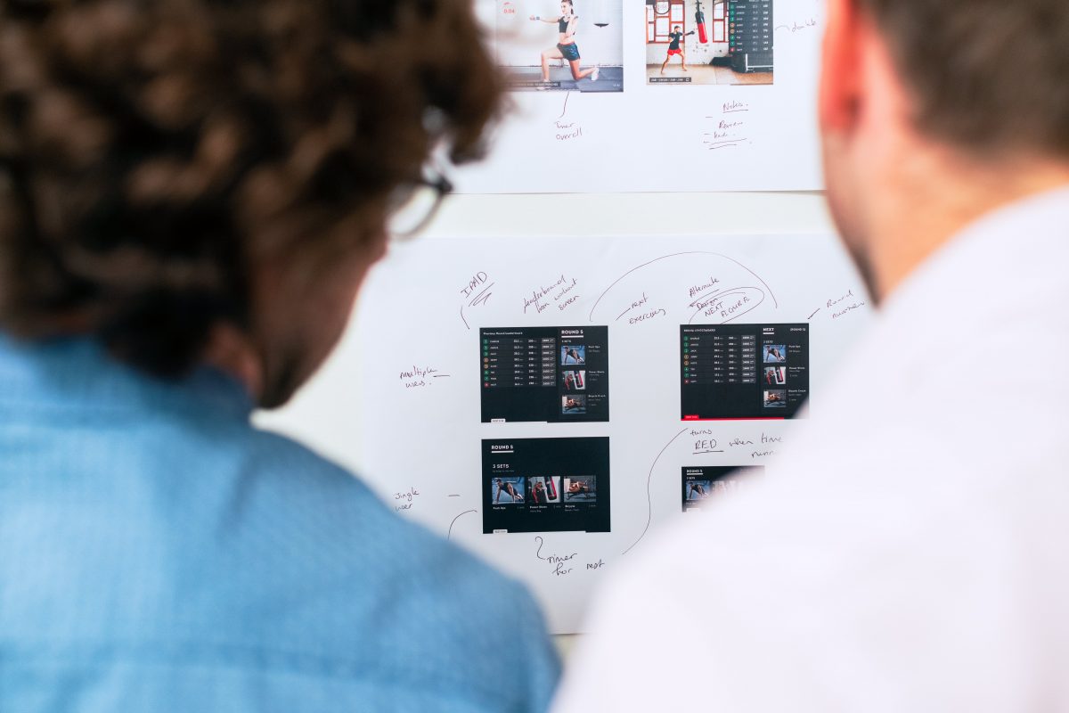
Making your app stand out in a digital marketplace is a challenge, to say the least. Creativity, striking the perfect balance between functionality and aesthetics are more important than ever. At MessApps, we’ve honed this craft we like to call ‘functional minimalism’. This design philosophy isn’t just about creating apps that look good — it’s … Continue reading “Balancing Functionality and Aesthetics In App Development”

It’s a tricky question! Well-designed apps are the ones that customers enjoy using, and that is a shared responsibility of UX & UI 🙂 UX (user experience) and UI (user interface) are like siblings of the app design process – they’re interconnected but each has its own unique areas of expertise. While UX focuses on … Continue reading “UX or UI: what’s more important in app development”

So it happened. UX/UI designers shot themselves in the foot. Doing an amazing job in improving user experience and user journeys, they left no room for imperfection. Today’s users expect smooth and pleasant interactions with digital platforms and products. Unnecessary steps in the user journey, bugs or broken links, and lack of attention to usability … Continue reading “UX/UI and ROI love triangle”
New technologies can be amazing. They can help people solve their problems, or simplify their lives. Despite all this, they can look difficult and incomprehensible. The goal here is not just to make a beautiful presentation of the project. It is more about using DESIGN to show investors and potential users the true value of … Continue reading “Attracting Investors Through Design”
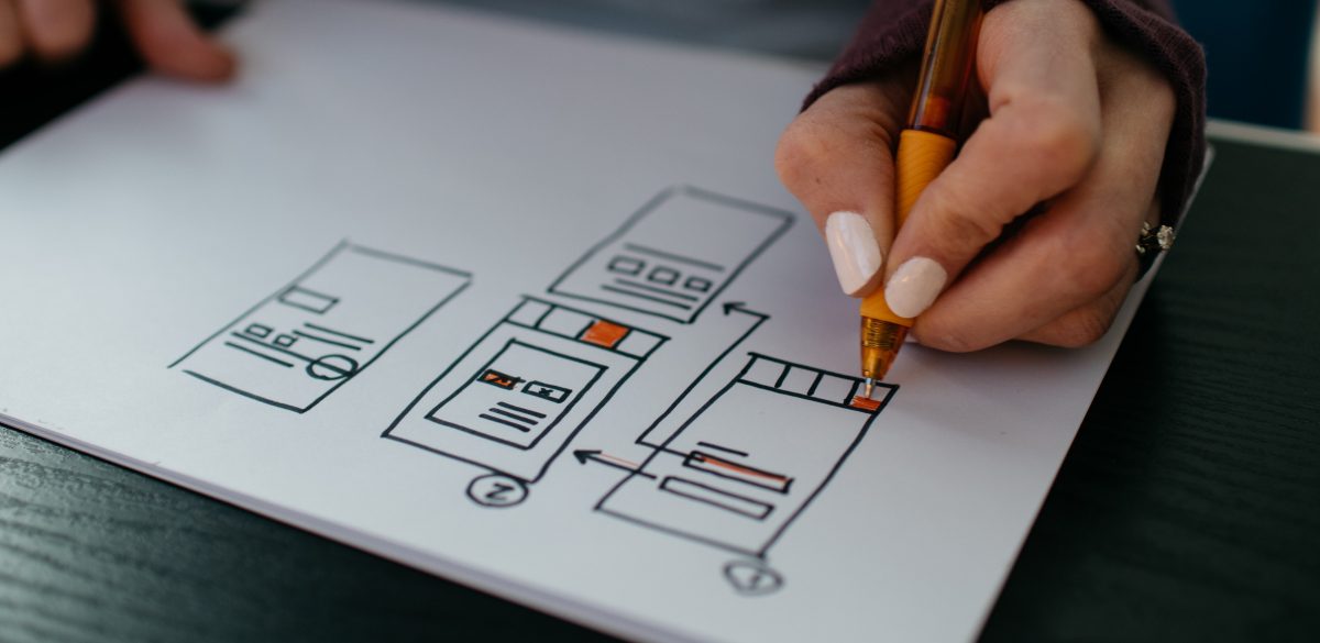
Unfortunately, when trying to turn your dream into a reality, misunderstandings and poor designs plague the industry. Fortunately, there is a way around this mess. Creating a solid wireframe as the core leader to functionality is no doubt, the best template to provide your designer to work from. This will ensure turning your appreneurial dream … Continue reading “Your First Mobile App Wireframe”

After you figure out what you want your app to do and who you want it to be for, the next step is getting a rough idea of how it will look and work. For this, you make a mockup, a black and white outline for all of the screens in your app, with all … Continue reading “Top 5 Mistakes in Making a Mockup”

Each platform has its own personality. It’s always best to design elements that are cohesive to the platform’s personality as this will make your app feel right at home. It makes the app easier to learn from your customers as they will be familiar with the flow from using other apps. Like every piece of … Continue reading “Overview Of iOS Design Guidelines”

Material Design is a design language created by Google. Initially, it was announced on June 25, 2014, at the Google I/O developer conference. Before it was officially dubbed “Material Design”, employees referred to it by the codename “Quantum Paper”. With Material Design paper becomes a metaphor; the aesthetic represents a flat sheet of floating in … Continue reading “What Is Material Design?”
Did you know that Messapps does not only work on app development but also on the app and website design? A team of UX & UI designers works with us so that we could provide the most complete possible solutions to our clients. Today Yaroslav, Messapps’es content manager talked to our design team to find … Continue reading “Tools for UX & UI designers. Interview with Messapps Design Team”
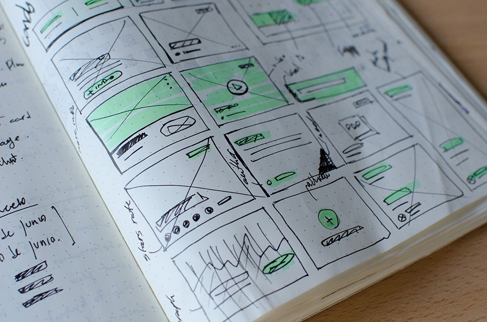
Your app is so much more than just a collection of pages, connected to each other and constructed for a particular purpose. It’s an interface, a platform, a tool, and a virtual space designed to meet a specific need, or promote a company, or provide solutions to an identified problem. As such, careful thought needs … Continue reading “Top Tips for Great User Interface Design”

Color blindness is the common term for a condition where individuals often mistake shades or lose their ability to distinguish colors at all. Women are less likely to have this disease when approximately every twelfth man is prone to it. In the article, I tried to gather and summarize notes of designers and developers about … Continue reading “Color Blindness: How To Design An Accessible User Interface”
When it comes to making a powerful impression and pushing the identity of a brand, color is key. Just look at some of the most iconic color combinations of the world’s most famous companies – Coca Cola’s red and white, IKEA’s blue and yellow, McDonald’s ‘golden arches’ – the list goes on and on. These … Continue reading “Psychology of Color in UI Design”